Agricultural drone surveys
We evaluated and bought drones for agricultural inspections, then flew them over groves and orchards. The pictures are beautiful. The service did not stick. We sold the aircraft.
We bought a DJI Mavic 3 Multispectral (Mavic 3M), learned the maps, and sold the aircraft.
The drone
After looking at a few agricultural platforms we bought the DJI Mavic 3M: a foldable quadcopter built for mapping, not for spraying or carrying tools. DJI launched it in 2022 as a two-in-one camera system — one RGB camera you can look at, plus four narrow spectral bands the eye cannot see.
- RGB camera — 20 MP, 4/3 CMOS, mechanical shutter. The stills have a lot of detail. That is what we liked first.
- Four 5 MP multispectral cameras — green (560 nm), red (650 nm), red edge (730 nm), and near-infrared (860 nm), plus a sunlight sensor on top so the bands can be calibrated.
- RTK — centimetre-level positioning, so maps line up without a field full of ground control points.
- Flight time — DJI rates up to 43 minutes in still air. In real work we got about 30 minutes per battery, then a swap.
- Weight — about 951 g. DJI says one flight can cover around 2 km² in good conditions. That is the brochure. Wind, overlap, and battery swaps eat into it.
The remote and DJI’s firmware handle automated survey grids well enough. You draw a field, the aircraft flies the lines, the cameras fire. That part works.
What we liked
The RGB photographs are sharp. You can see individual trees, gaps, and damage that a walk through the grove would take hours to find. After a survey the same camera is just a camera — and Calabria from the air is worth looking at on its own: olive groves on every ridge, a farmhouse in the valley, hills fading blue.
The other reason we bought it is the four narrow cameras. A leaf bounces some wavelengths and eats others. The stills in Five cameras are one frame from each. Indexes such as NDVI, GNDVI, and SIPI turn those bands into a colour map of healthy patches versus ones that need a closer look.
That is what a camera drone can actually do for an orchard: mark where to walk next. It is more precise than public satellite layers. The catch is that open satellite imagery is catching up, and it is free to access. A drone still wins on resolution and on flying the day you choose. It does not win on cost once you add the aircraft, batteries, insurance, and a person who is allowed to fly.
Five cameras, one grove
The fifth sensor — the one that is easy to forget — is red edge, a narrow slice at 730 nm. The Mavic 3M has five cameras: one RGB you can look at, then green (560 nm), red (650 nm), red edge (730 nm), and near-infrared (860 nm). The four below are the same nadir grove, one band each. We tinted the single-band stills so they are not all grey. The tree is not that colour.
A leaf is doing two jobs. Chlorophyll absorbs blue and red to run photosynthesis. It does not want green as much, so some green bounces — that is why olives look silvery-green from the lane. It also does not want near-infrared: that energy would heat the leaf without feeding the chemistry. The spongy tissue inside a healthy leaf (the mesophyll) reflects NIR strongly. When the leaf is stressed, that structure slumps a little and NIR drops, often before anything looks brown from the ground.
Red edge is the cliff between those two behaviours. Healthy canopy: a sharp jump from absorbing red to bouncing NIR. Stress: the cliff moves. Look at the same trees across the four bands. In the red still the crowns go pale, almost white — they ate that light, so little of it comes back. In the NIR still they go red in this tint — they are throwing that band back. Green sits in between. Red edge is the halfway house.
Software then does arithmetic, not prettier photographs. NDVI is (NIR − red) / (NIR + red): a pixel that ate red and bounced NIR scores high. GNDVI swaps in green. NDRE uses red edge instead of red. The indexes and the maps further down are those ratios, painted on a colour scale.
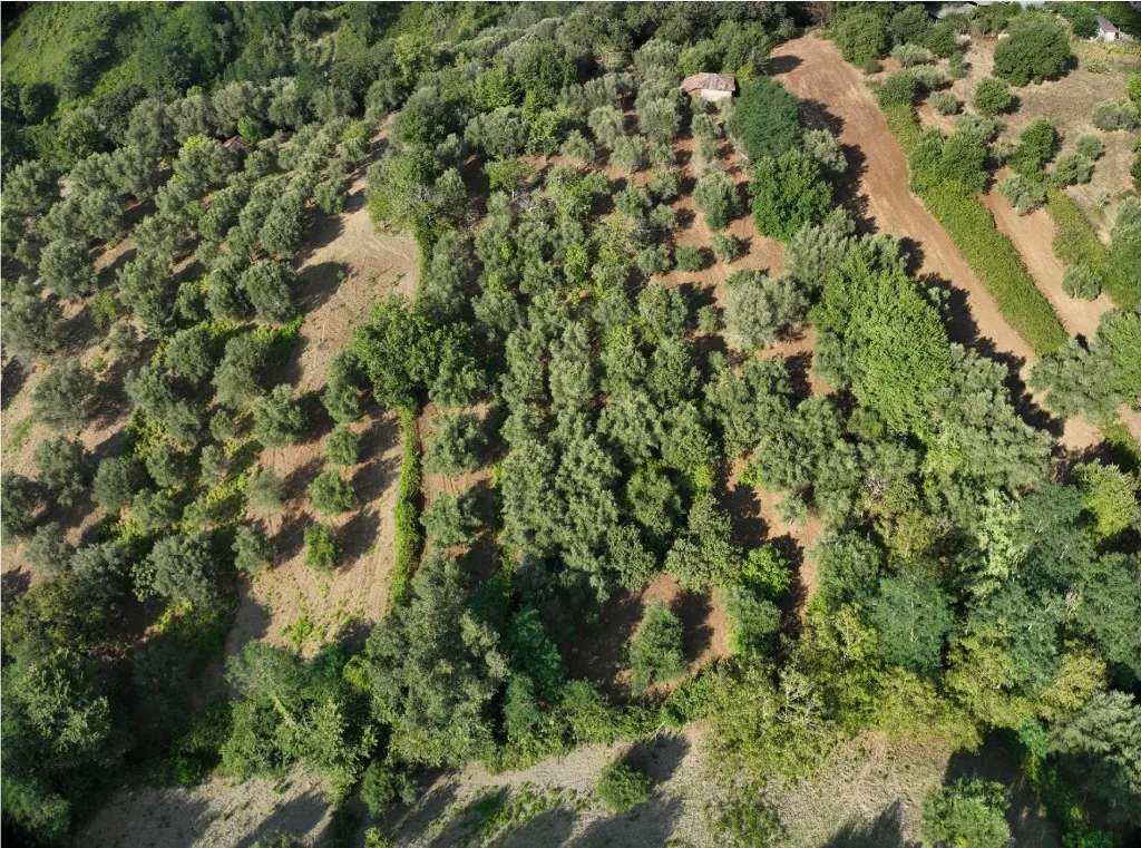
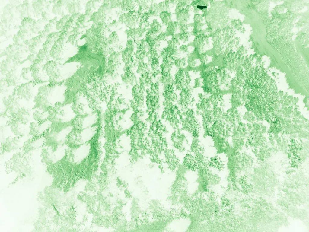
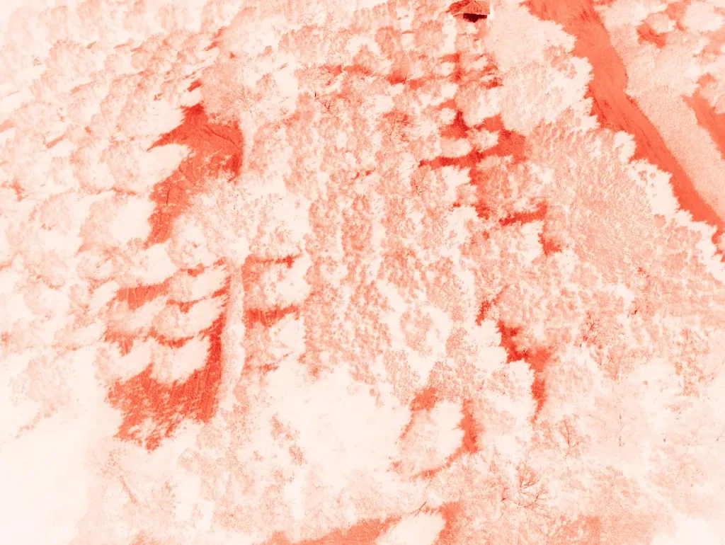
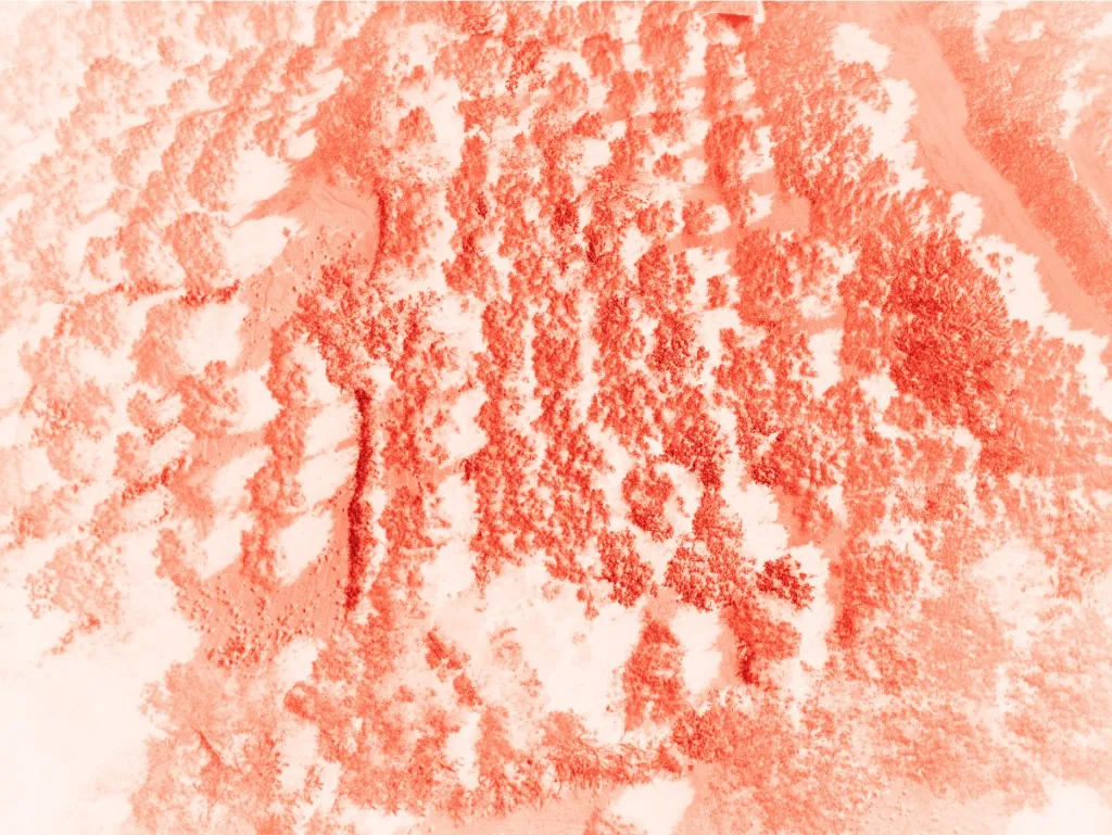
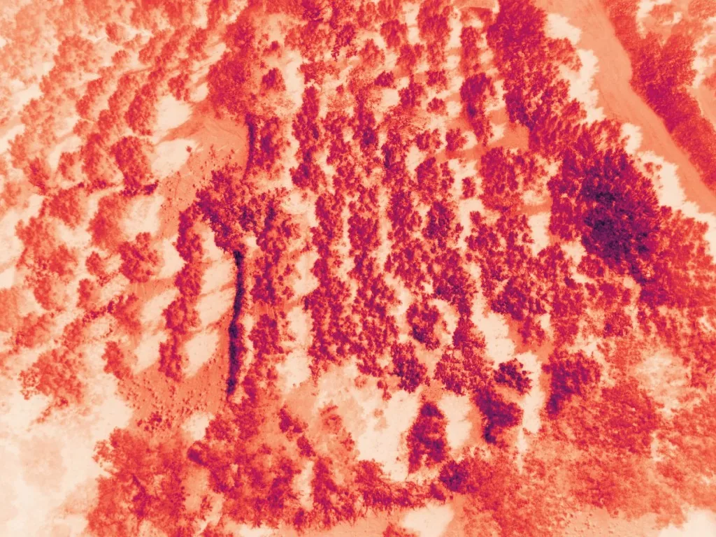
DJI Mavic 3M, one still per camera. RGB is a photograph. Green, red, red edge, and NIR are single bands with a tint so they do not all look grey. Click for the full image.
What the colours mean
Those four narrow bands become an index: one number per pixel, then a colour scale. The legend under each map is that scale. Soil is not a sick tree. A yellow crown next to a red one is the interesting part.
- NDVI — (NIR − red) / (NIR + red). Range −1 to 1. Healthy leaves bounce NIR and eat red, so a dense olive canopy sits high (often 0.6–0.9). Bare soil, tracks, and hay sit near 0 or below. The index everyone quotes. In the stills above that looks like pale crowns in red and red crowns in NIR — the tint, not the tree.
- GNDVI — same formula, green instead of red. More sensitive to chlorophyll when NDVI has already maxed out on a thick canopy. Useful for vigour and nitrogen later in the season.
- SIPI — (NIR − blue) / (NIR − red). Pigment stress: carotenoids versus chlorophyll. It can move before the tree looks yellow from the ground.
- NDRE — same idea with the red-edge band (730 nm). It looks a little deeper into the canopy than NDVI. We used it less in the Pix4D screenshots below.
- Orthomosaic — not an index. Stitched nadir photos, geometrically corrected. RGB, or false-colour when NIR is painted into a visible channel (teal canopy, pink soil).
- DSM — digital surface model. Also not an index. Height of everything the drone sees: ground plus tree tops. Slope for water; the red blobs are canopy height.
Can you see it?
These maps are from Mavic 3M flights over Calabrian groves, processed in a Pix4D free trial (August 2024). The software is easy to use. Healthy patches and the ones that need a closer look jump out — once you know what the colours mean. Two plots: a hillside grove (20 m scale, a roof in the corner) and a strip of rows next to a hay field (50 m scale).
Start with the ordinary aerial photo around the magenta box: similar green crowns, dirt tracks. Now look inside the box. That is not a prettier picture. It is a measurement.
How to read them — then try it yourself. Blue or cyan between trees is usually soil or a path, not a dying olive. On NDVI and GNDVI, deep red is dense, vigorous canopy. On SIPI, the high signal is often blue-cyan instead. Yellow and orange on a crown that should be “hot” is the interesting part: thinner foliage, a smaller tree, a gap in the row. The RGB photo makes every tree look fine. The index does not.
A few things to hunt for: which corner of the box has the fattest, reddest (or bluest) crowns? Where do the teal circles in the false-colour mosaic shrink and let pink soil show through? On the elevation layer the field is not flat. Where would water run after rain?
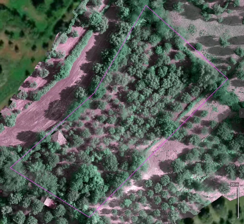
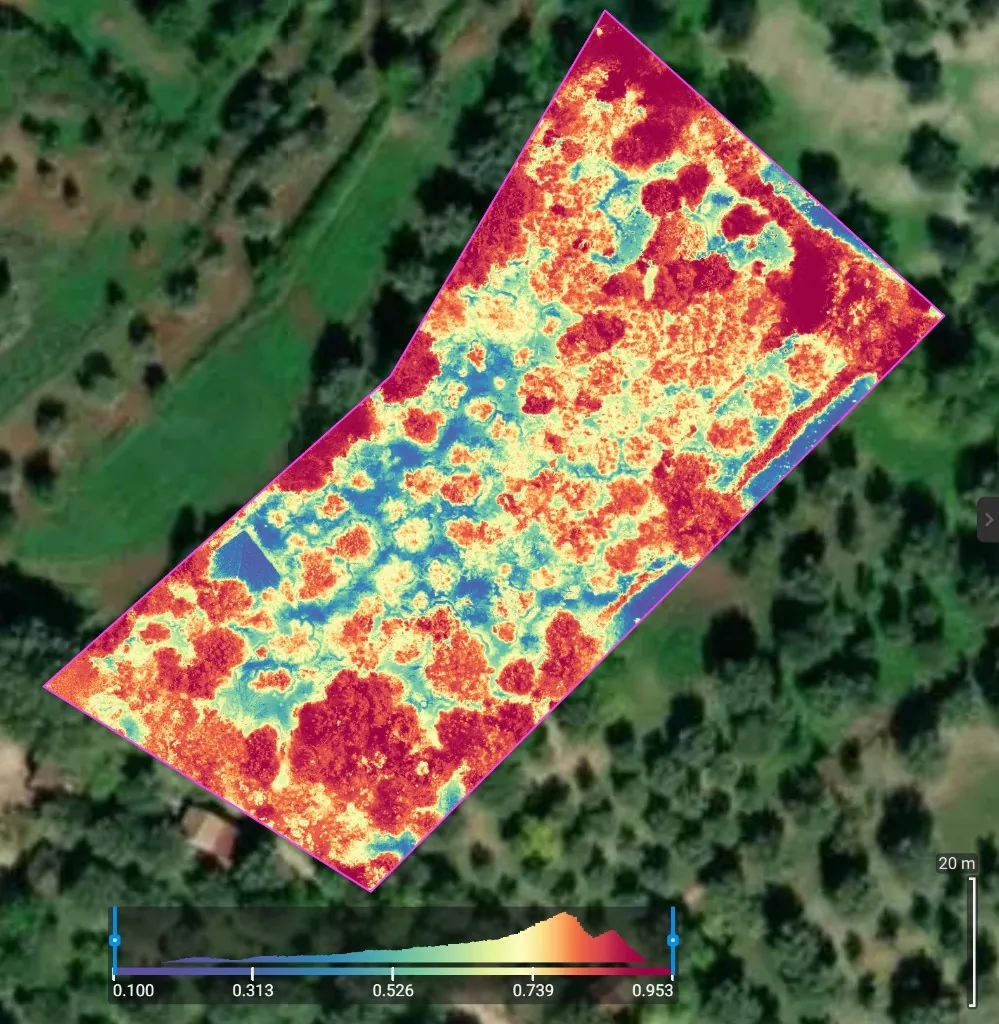
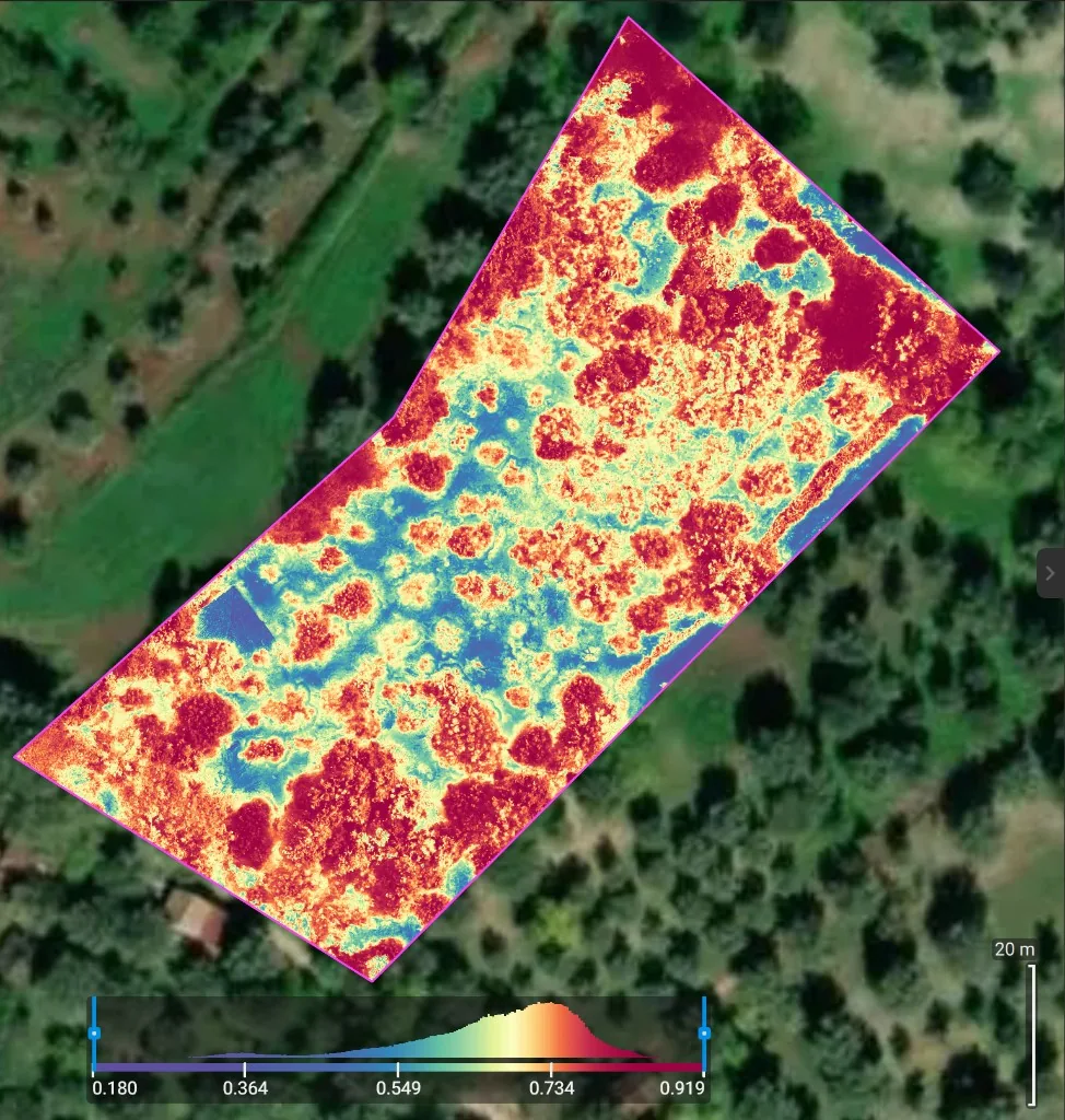
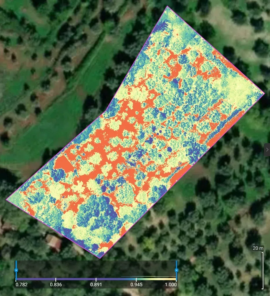
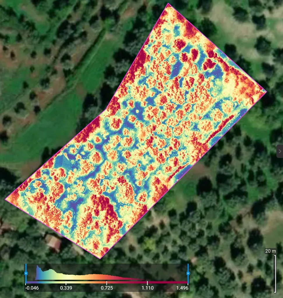
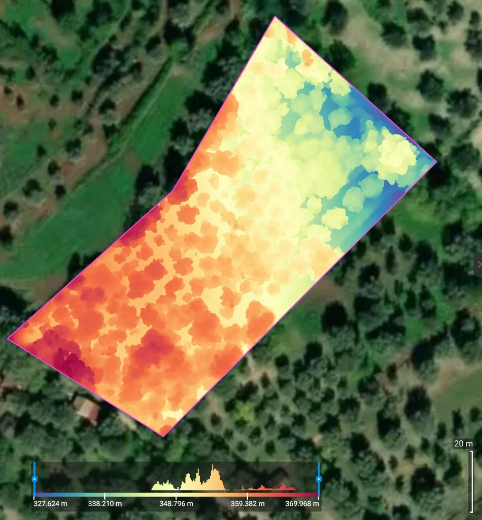
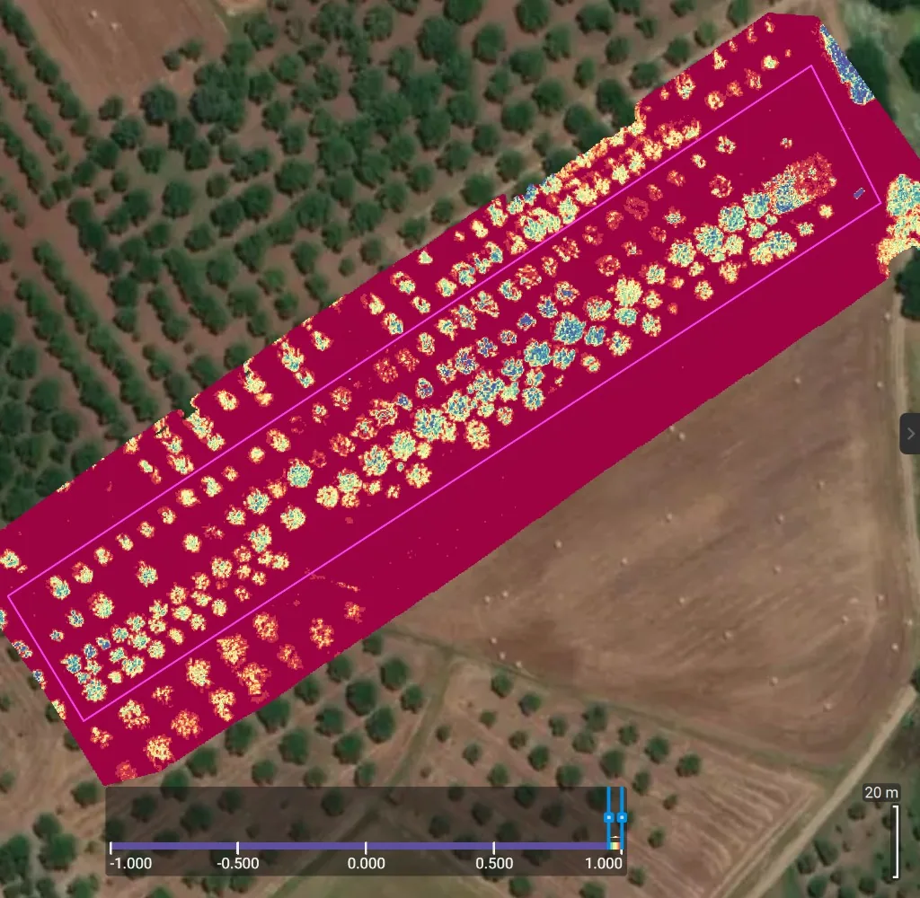
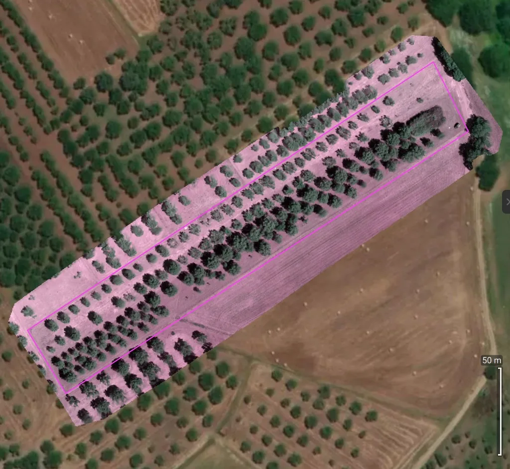
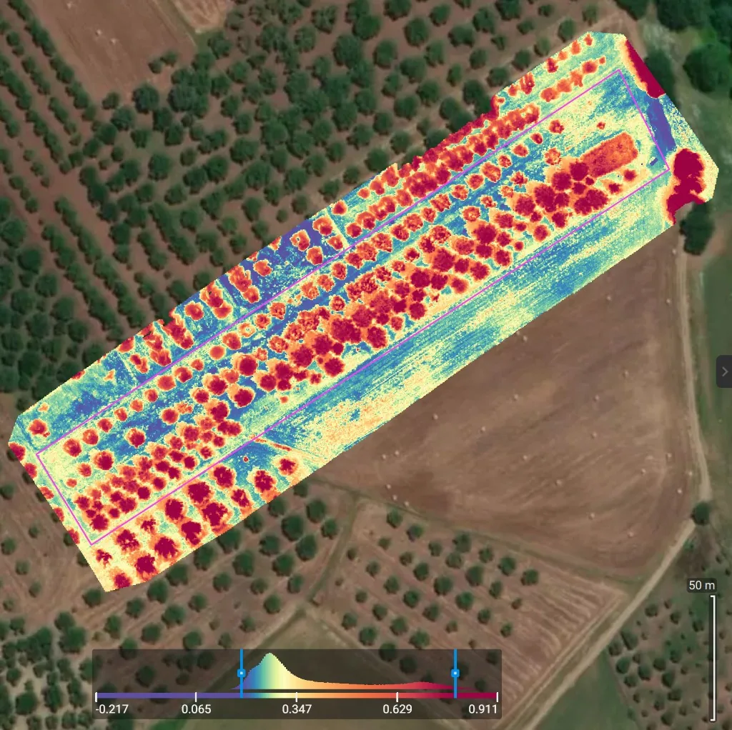
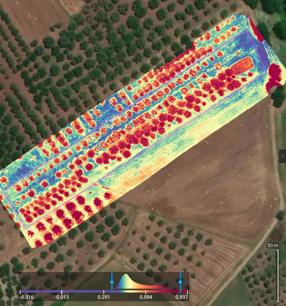
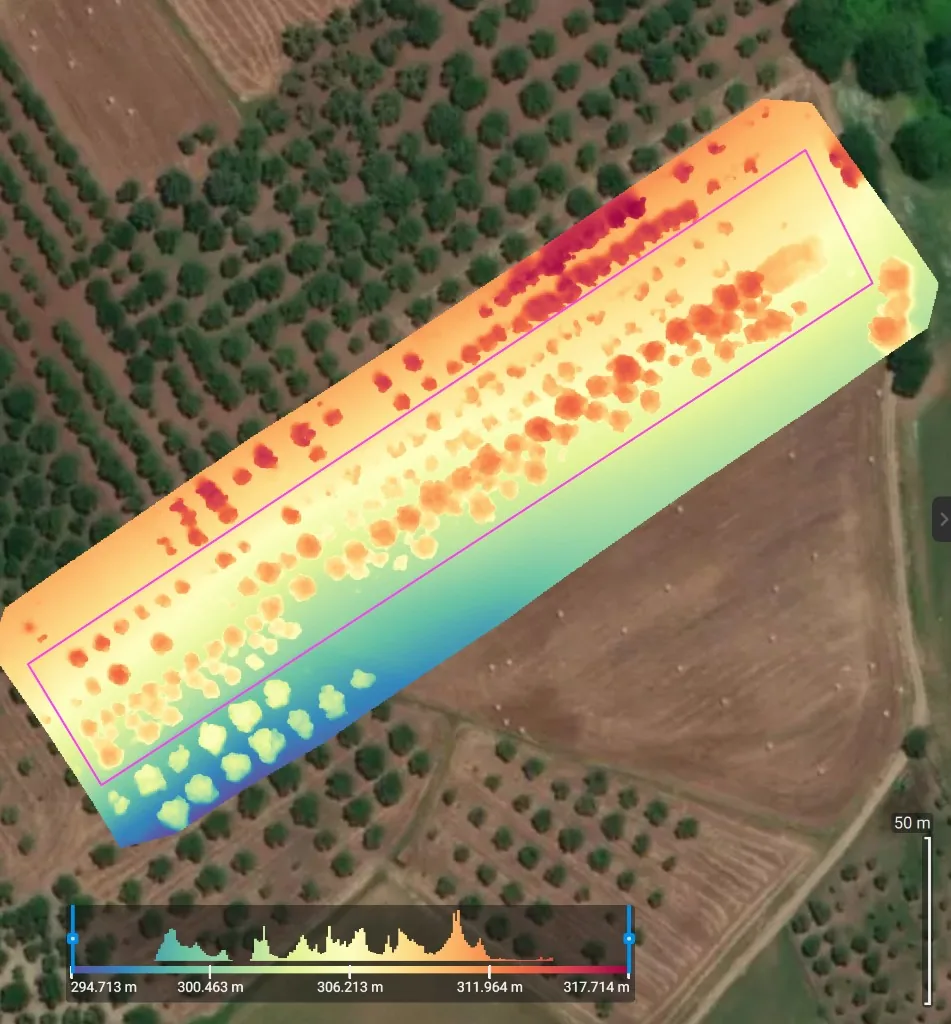
Two Calabrian plots, DJI Mavic 3M, Pix4D trial, August 2024. NDVI, GNDVI, SIPI, false-colour orthomosaics, and DSMs. Magenta outline is the mapped plot. Click a map for the full image.
The grove in 3D
Flat maps are one thing. OpenDroneMap can also stitch the same survey photos — taken from different angles and points over the grove — into a three-dimensional model. Photogrammetry: overlapping stills become a textured mesh you can orbit. These two clips were rebuilt in WebODM, August 2024.
At a glance you see how the orchard sits: which crowns are fat, which rows have gaps, how the trees fill the slope. That is useful for planning pruning, and for watching how a planting grows year to year, without walking every line. It still does not prune the tree. It does tell you where to send the people who will.
Software
We tried the paid stack and the open one.
- WebODM (OpenDroneMap) — our favourite. It takes more software skill to stand up, then it works as a charm. Full control of the images, orthomosaics, indexes, and the 3D models above, on a machine you run. Free, because it is open source.
- DJI Pilot 2 and DJI Terra — the remote software does automated flights fine. Terra is DJI’s paid processing. The phone app is fiddly to install, and we were not comfortable with where the pictures go (see below).
- Agremo — we tested it. In practice it is mostly satellite analytics, not a substitute for flying the Mavic 3M yourself.
- Pix4D — we ran the free trial on the maps above. It works, and it is easy: healthy patches and the ones that need care jump out. Capable, and very expensive once the trial ends.
If you already have the images and want a pipeline you own, WebODM is the one we would stand up again. That kind of work — processing, indexes, a dashboard on an EU server — is closer to what we still hire out than flying the drone is. See software for devices and data.
What got in the way
The cameras are the easy part. Operating a survey drone is not.
- Liability. You are flying a kilogram of spinning carbon over someone else’s trees. Insurance and the fear of a bad landing are real costs, not paperwork.
- Regulations. EU drone rules, operator registration, and the rest. Not impossible. Not free either, in time or in money.
- Airports. Restricted flight zones around airports eat a surprising amount of agricultural land. If the grove sits in that bubble, you do not fly.
- Travel. The kit lives in a large bag. Batteries, controller, aircraft, spare props. Fine for a van. Awkward for a train or a small car, and worse if you hoped to hop between farms.
- Batteries. About 30 minutes in the air, then you land and swap. A large orchard is several flights, not one.
- Privacy. DJI’s firmware and phone software work, but they are awkward to install, and it is likely that DJI and related services can see the images and flight logs before you have a copy you fully control. For farm data, that was a problem for us. WebODM on our own machine was the opposite: the pictures stay put.
Why we stopped
Olive growers and orchard farmers do not wake up needing an NDVI map. They need harvesting and pruning done. A quadcopter with cameras cannot do those jobs. It can tell you which patches look healthy and which look stressed. That is useful. It is not the bottleneck.
We did not find a market for the survey service. Farmers were not asking us to fly. Open satellites are good enough for many of the same questions, and they do not need a pilot, a bag, or a restricted-zone check. So we sold the agricultural drone. Little use, little value added for customers, and the aircraft sitting in a bag is not research we wanted to keep paying for.
The lesson sits next to Gibbon Bot: the hard jobs in a grove happen in the canopy, with hands or with a machine that can grip. Looking down from the air is a different product. We learned NDVI, we learned the software, and we sold the aircraft.
Work with us
If the question is whether a drone, a tractor, or waiting is the right move for a crop and a job, that is consulting — a call and a written report.
If you already fly, and you want processing you control — orthomosaics, vegetation indexes, a dashboard on a server in Europe — that is software. Email services@olivabot.com.